Government Spending: A Recap
Government spending was a central issue in the 2010 elections, and it has remained an important concern in this election cycle, especially for independent voters.
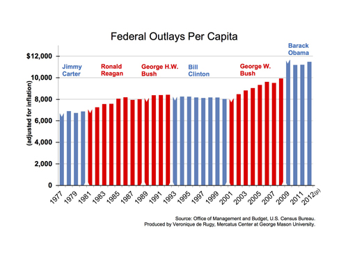
Using data from the Office of Management and Budget, this chart shows the amount of real federal dollars spent per capita over the past 40 years. The data clearly highlight that, after adjusting for population and inflation, federal outlays have, with a few exceptions, mostly grown, with a clear increase over the past 12 years.
The first Carter budget spent $6,600 per person, and president Reagan’s first budget spent $7,000. His successor’s first budget spent $8,100, and president Clinton’s first budget spent $8,200. Remarkably, the Clinton era oversaw a decline in the per capita spending—from $8,200 to $8,000 over eight years. But that trend was radically reversed during George W. Bush’s two terms. President Obama’s first budget spent $11,600 per capita.
Spending increases are projected to continue, driven by the fiscal demands of programs such as Social Security, Medicare, and Medicaid. This chart—and the supporting charts below—provide further evidence that this country has a spending problem and needs to start making cuts to restore government spending to sustainable and responsible levels.
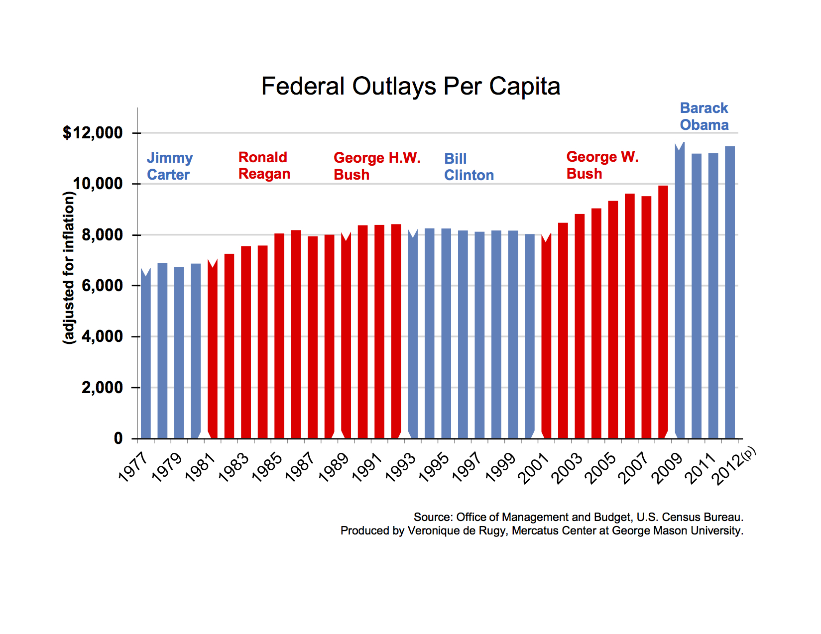
Chart supplement 1 (click to enlarge)

Total federal outlays measured in real terms (adjusted for inflation). Relative to the main chart, these outlays grow at a faster rate each year.
Chart supplement 2 (click to enlarge)

Total federal outlays measured in nominal terms (not adjusted for inflation). The nominal data help portray the level of spending with the purchasing power of money in that current year. Such data show an even more magnified growth in spending relative to the previous charts.
Chart supplement 3 (click to enlarge)
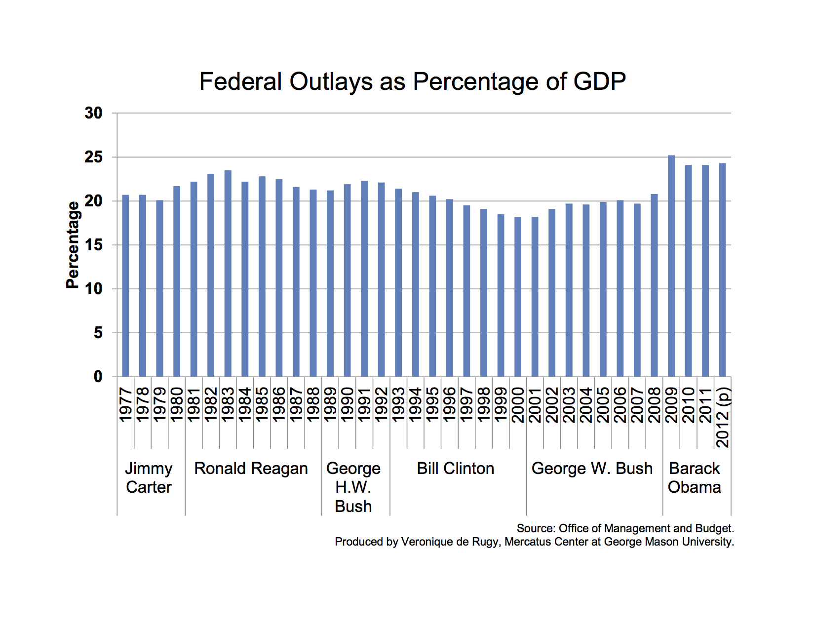
Total federal outlays measured relative to total economic output or GDP. Measuring outlays as a portion of GDP shows how much spending grows with respect to the total amount of wealth produced within a given year.
Chart supplement 4 (click to enlarge)
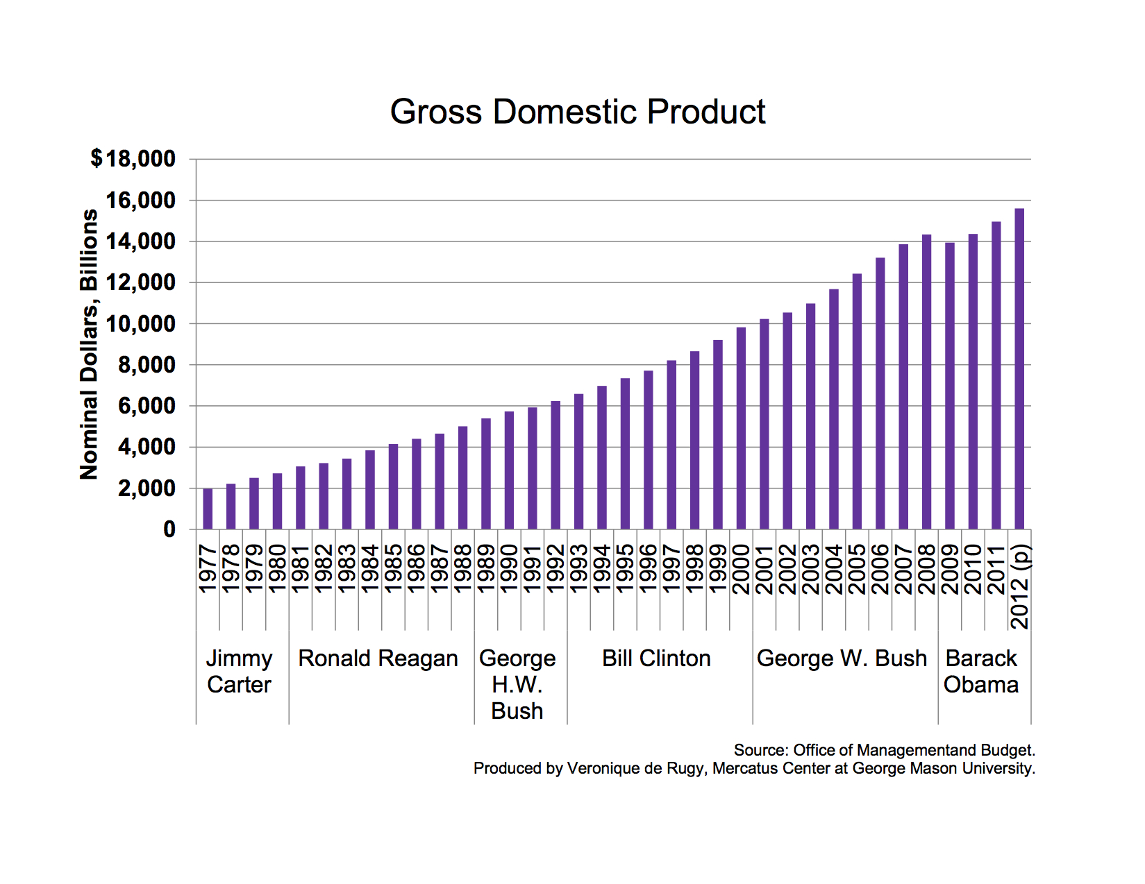
Gross domestic product, 1977–2011. This chart shows the evolution of the nation’s total economic activity. The 2012 data is projected.
No comments:
Post a Comment